- home>
- Typography Contest>
- Seoul Typography Contest – Yfenne Lee
Typography Contest
-
Seoul Typography Contest – Yfenne Lee
-
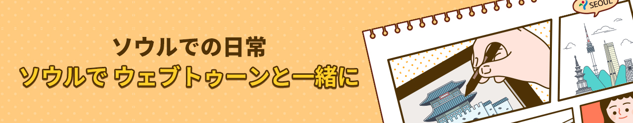
Typography Contest 登録日投稿者 ヒット561The first word that came up in mind when I imagine Seoul is chic. What I visualize is stylish pedestrians walking on the crossing roads in a pretty fast pace, thus, I decided to go with two bold and swift colors of red and black. I chose to style “Seoul” as a fashionable silhouette because I see the Mecca of shopping malls. Brown and yellow were used for the name of various tourist attractions to give a more chill and relax feel. I chose to use Chinese and English characters in it that portray Seoul as an international destination. The bubbly characters are used to give off the feeling of fun and excitement.
Like It
69 人がいいね!と言っています。
Related Contents

")
")